Tooltip Widget - flutter

A tooltip is a built-in widget in Flutter that uses material design and displays a textual description of the widget in a floating label when a user long presses or hovers over it. When the application's UI is too dense to display all of the information on the screen at once, the tooltip widget comes in handy; it essentially makes the app more accessible.

In this post, we will look at the process of adding a Tooltip to an application by creating an app with infinite content of Mobile Application.

Step-by-Step Implementation


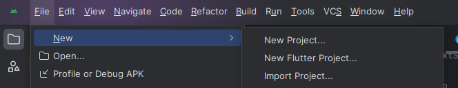
Step 1: Create a New Project in Android Studio (File >new flutter project).


Step 2: Adding material package 

Import method the runApp method in the main function call first while run the application.

 import 'package:flutter/material.dart';

 void main() {

     runApp(RunMyApp());

 }

Step 3: Creating a stateless widget 

We can create a stateless widget that contains MaterialApp widget,AppBar,etc.

 class RunMyApp extends StatelessWidget {

     const RunMyApp({super.key});  

    @override

    Widget build(BuildContext context) {

    return MaterialApp(home);

     }

 }

Step 4: Below code write a Tooltip in a flutter.
 Tooltip(
message: 'Demo Tooltip 3',
child: Text(
'Demo Tooltip 3',
style: TextStyle(
fontSize: 25,
),
),
)
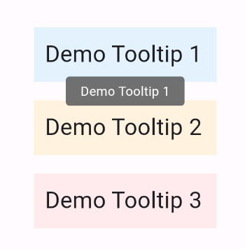
Step 5: Final code of Tooltip.
 import 'package:flutter/material.dart';

void main() {
runApp(tooltip());
}

class tooltip extends StatelessWidget {
const tooltip({Key? key}) : super(key: key);

@override
Widget build(BuildContext context) {
return MaterialApp(
home: Scaffold(
appBar: AppBar(
title: Text('Candidroot Solutions'),
backgroundColor: Colors.blue,
leading: IconButton(
icon: Icon(Icons.menu),
tooltip: 'Menu',
onPressed: () {},
) //IconButton
), //AppBar
body: Center(
child: Column(
mainAxisAlignment: MainAxisAlignment.center,
children: <Widget>[
Container(
child: Padding(
padding: const EdgeInsets.all(12.0),
child: Tooltip(
message: 'Demo Tooltip 1',
child: Text(
'Demo Tooltip 1',
style: TextStyle(
fontSize: 25,
),
),
),
),
color: Colors.blue[50],
width: 200,
height: 60,
),
Container(
height: 20.0,
),
Container(
child: Padding(
padding: const EdgeInsets.all(12.0),
child: Tooltip(
message: 'Demo Tooltip 2',
child: Text(
'Demo Tooltip 2',
style: TextStyle(
fontSize: 25,
),
),
),
),
color: Colors.orange[50],
width: 200,
height: 60,
),
Container(
height: 20.0,
),
Container(
child: Padding(
padding: const EdgeInsets.all(12.0),
child: Tooltip(
message: 'Demo Tooltip 3',
child: Text(
'Demo Tooltip 3',
style: TextStyle(
fontSize: 25,
),
),
),
),
color: Colors.red[50],
width: 200,
height: 60,
),
],
)
), //Center
),
);
}
}
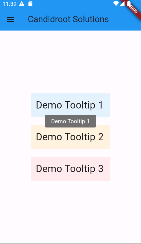
Step 6: Output of above example.


Happy coding!

365Bloggy June 14, 2024
Share this post
Tags
SUBSCRIBE THIS FORM


Archive